Camgrain Rebrand
Camgrain is a farmer-owned co-operative established in 1983. It is a network of co-ordinated stores that provide its farmer members with harvest collection services and exclusive access to premium markets. The centres have over half a million tonnes of storage capacity supported by state-of-the-art processing technology, logistical excellence, marketing expertise and food industry standard accreditation.
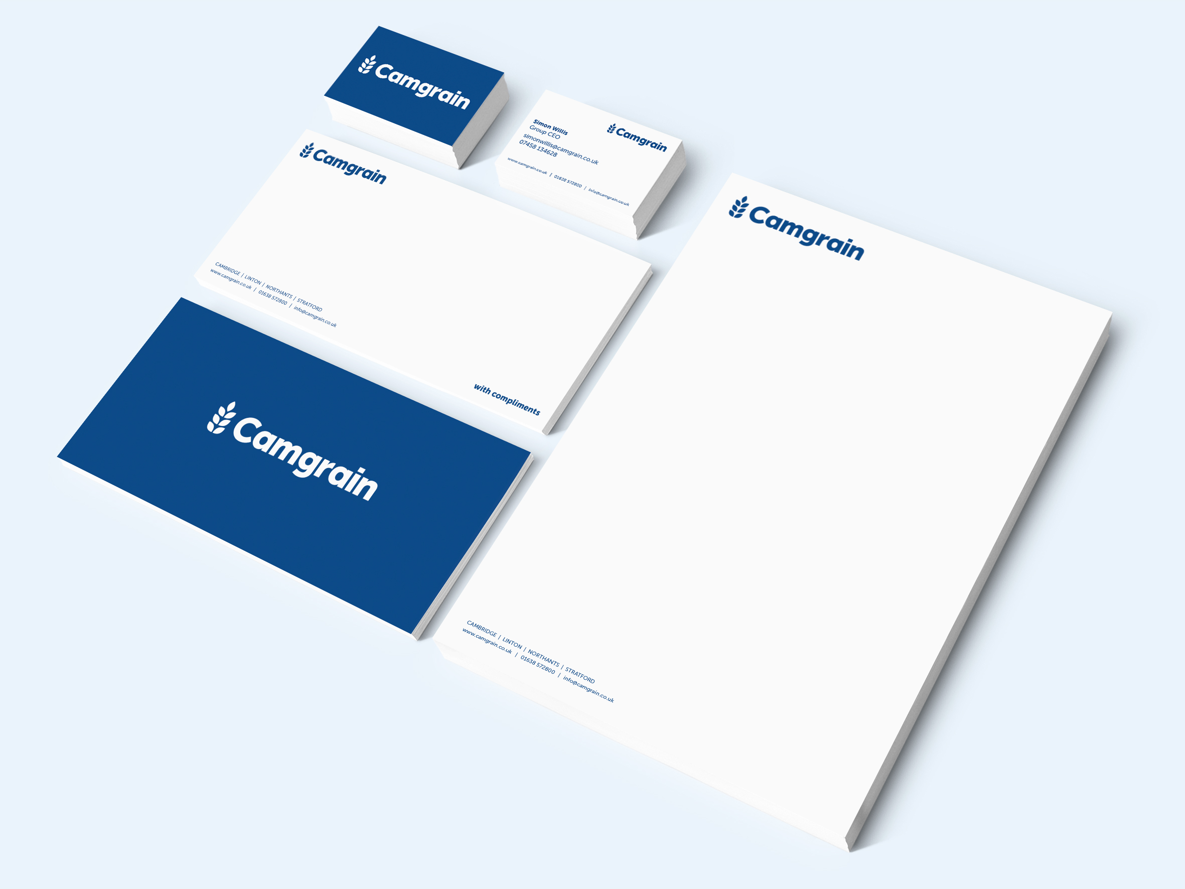
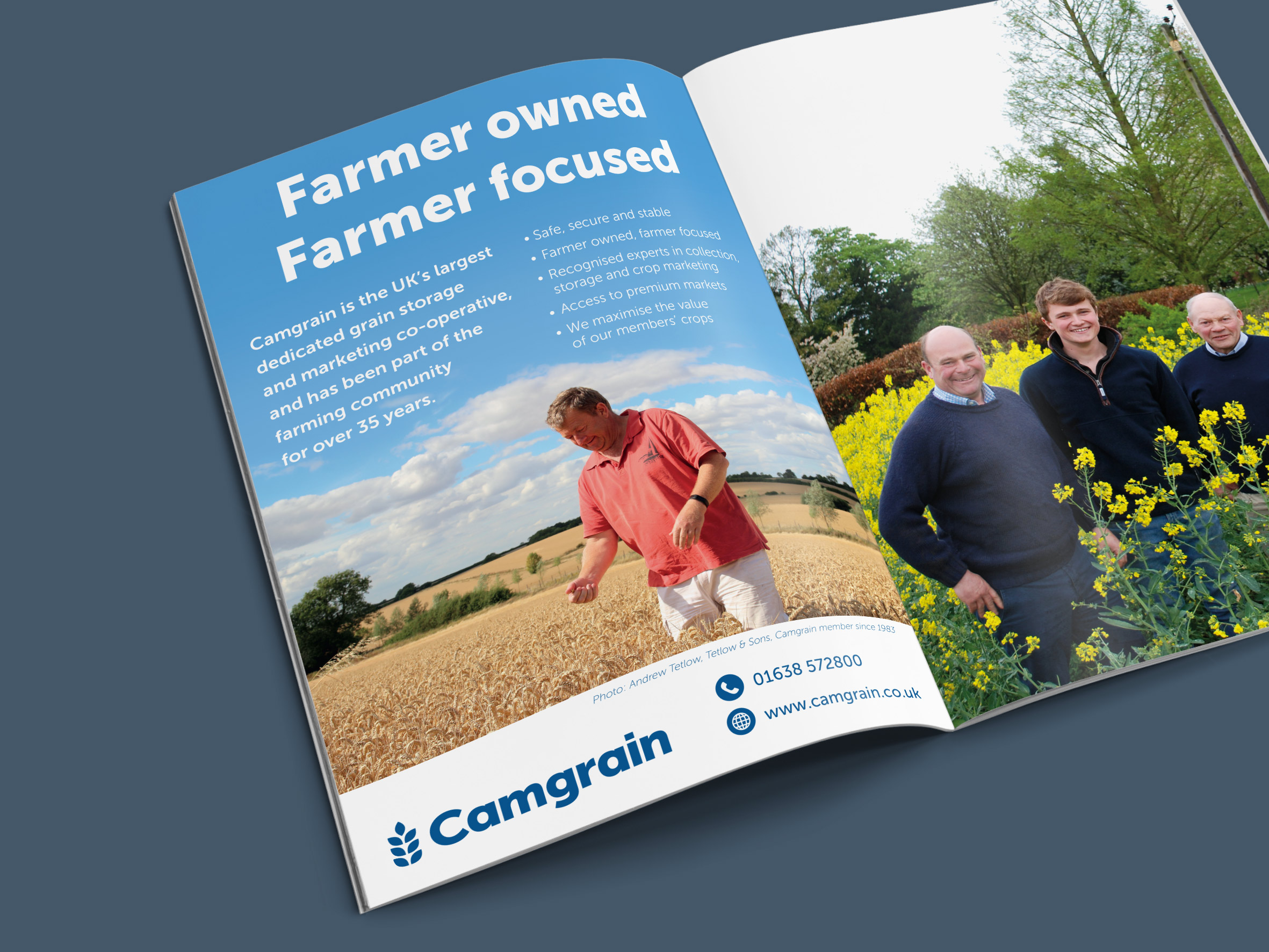
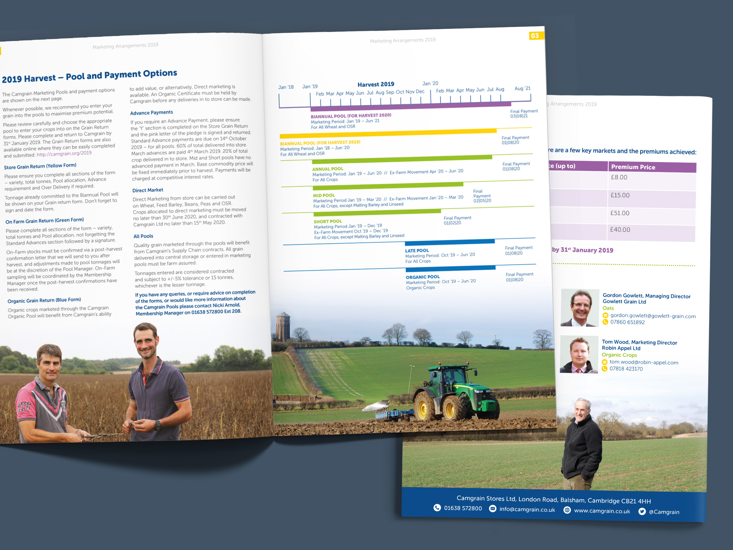
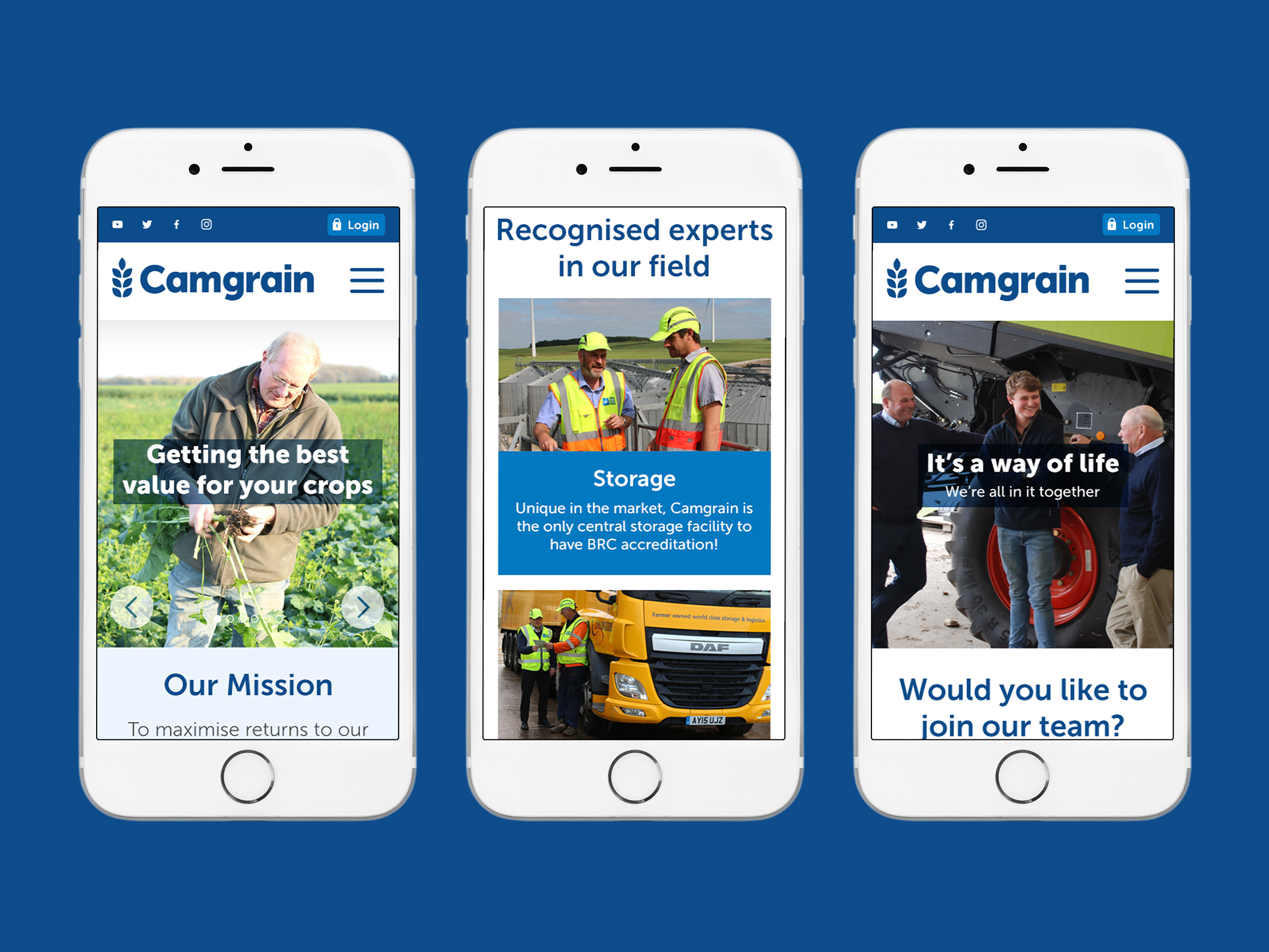
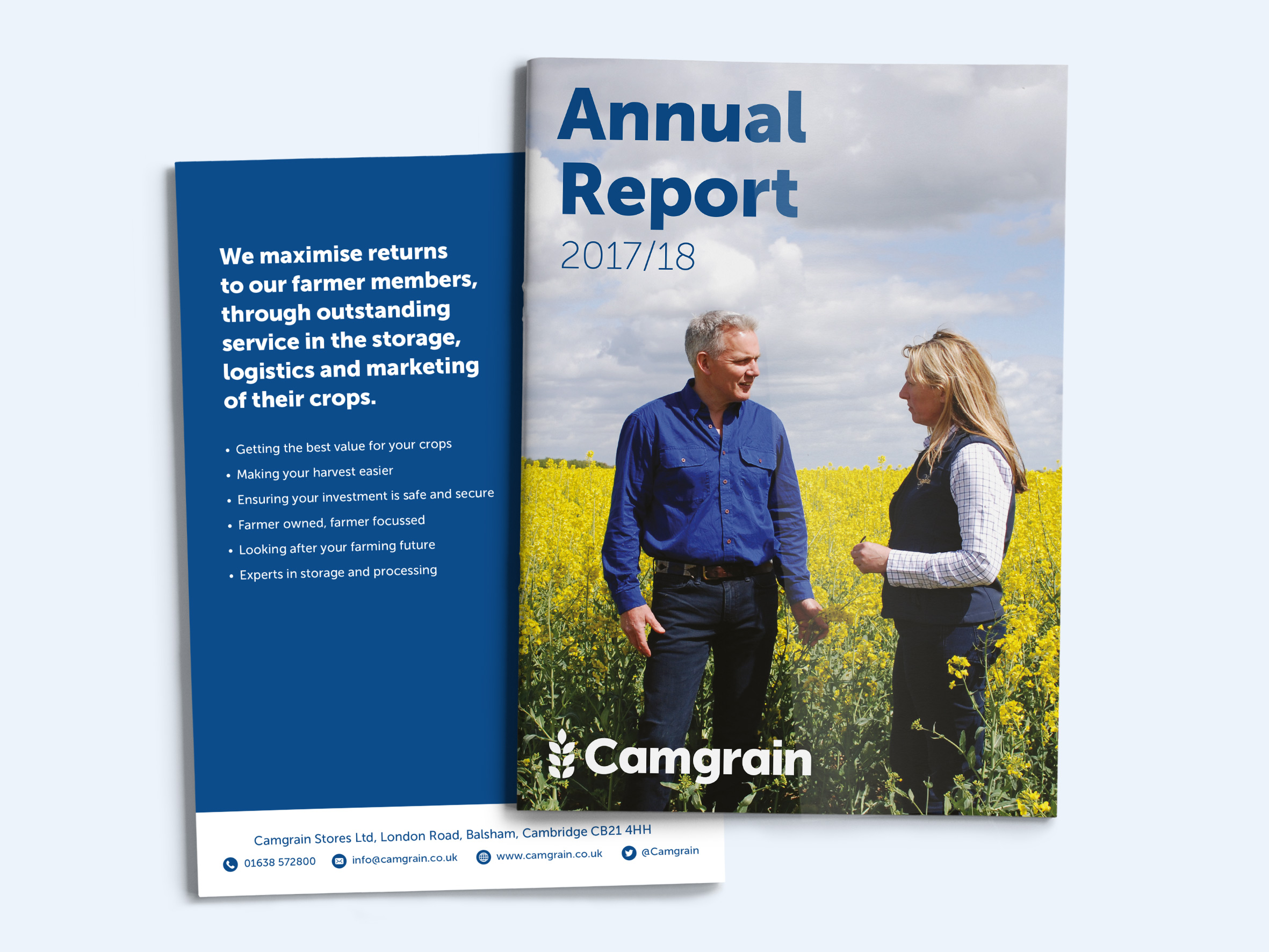
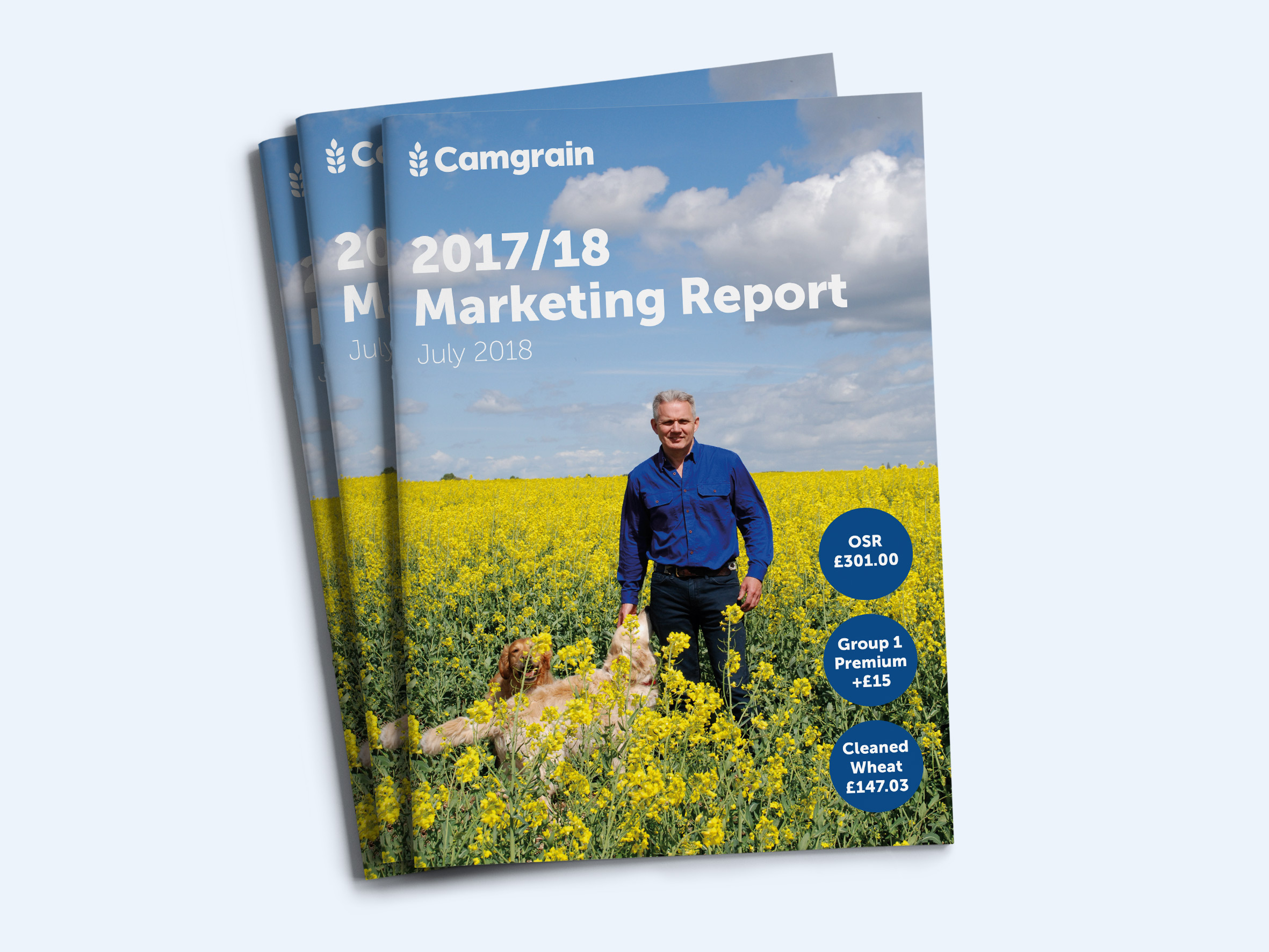
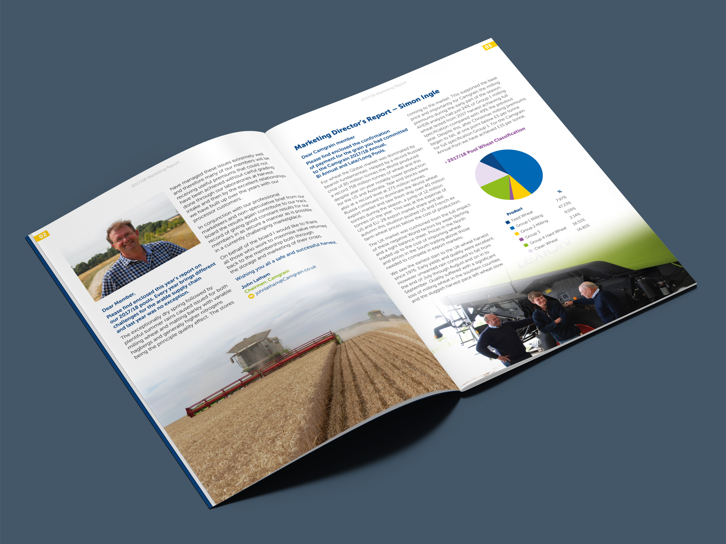
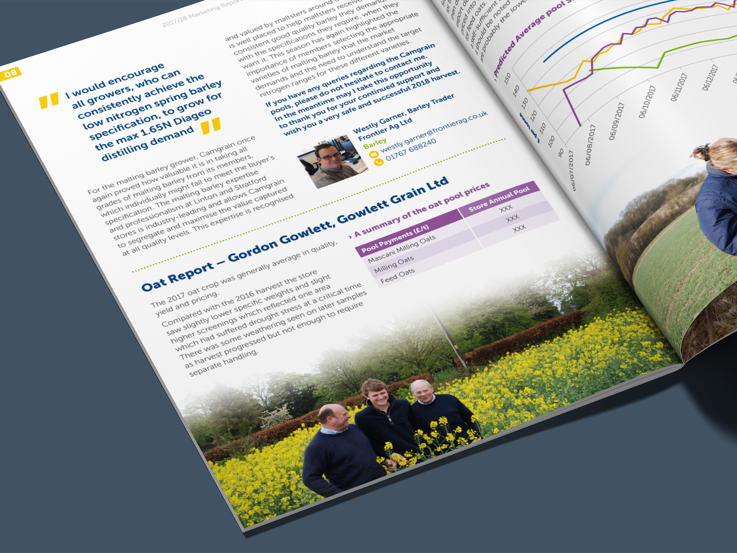
I started working with Camgrain early in 2017, giving their brand a refreshed look. This evolution was actually prior to the visual identity you can see on this case study. Camgrain wanted to keep the same fonts, colour palette and logo, but give their marketing collateral a more contemporary look. We achieved this, however the logo remained looking someone outdated. In 2018, I had the privilege of working with the team to overhaul the logo and evolve the brand along with it. I’ve enjoyed a great working relationship with the team, collaborating on several projects to date, including ads, reports, workplace documents and the website design for desktop and mobile. The brand is now clean and contemporary.
